


How do you choose your identity colors?
You want to professionalize the look of your company. You start with the logo and identity. The logo was once created when your company was in its infancy. It was adequate then, but as a now mature SME, the logo no longer fits. Time for a re-styling. But how do you start and what should you consider?
A very important and regularly underestimated pillar is color. This blog is about the psychology of colors, what color does to people, the significance of corporate identity colors and what you want to consider as a company if you want to achieve your mission.
Colors activate emotions
Colors bring about feelings. Think of the color bright red, for example. It is much more intense than a soft pastel. Blue is very safe and reliable and green relaxes you. But the strength of these associations vary from person to person.
Colors work subconsciously
Did you know that color can even affect your taste and trigger your appetite? There have been a lot of studies on the effect of colors. The obvious conclusion is that color wins out over black and white. Advertisements in color are remembered 100% more than black and white advertisements.
Research shows that people make subconscious judgments about a product or person within 90 seconds. Between 62% and 90% of that judgment is based on color and the associations and feelings the colors evoke.
So we go for color... But which one?
What is color psychology?
Color psychology is the study of the meaning of colors and their influence on human behavior. There are similarities in this. I say that somewhat cautiously because differences have been discovered in how people feel about and experience color.
Cultural differences in psychology of color
It varies by person, gender, age, experience and culture. For example, red is the color of happiness in China, but the color of mourning in South Africa. Green is a sacred color in Islam, but in Chinese culture it can stand for deception. In Western culture, white represents purity and cleanliness and many a bride walks in this color, but in many Eastern countries it is the color you see at funerals.
Do you get hit by a blue car? Then your perception of the color blue may not be "safe and secure" after this.
Just a few examples to be aware that "our" association with a color is not always shared. Therefore, when deciding on a color for your company, think carefully about what you are doing business with and with whom. We discuss the colors below from a Western and 'general' perception.
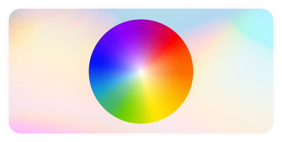
What does a color mean?
Its colors and associations in a row:
Blue
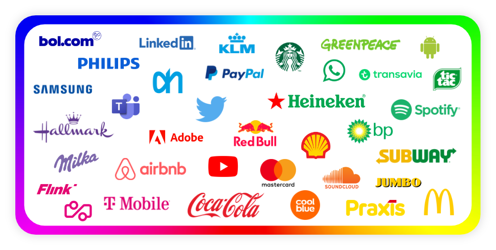
Blue is a wise, intelligent, confident, stable, bright and loyal color. Definitely a popular color in the business world, but most people also have blue as their favorite color in private. The brands that use this color want to inspire confidence and are often technical, formal and businesslike. Think of the IRS, PayPal, an accounting or law firm and, of course, Smart Content Creator.
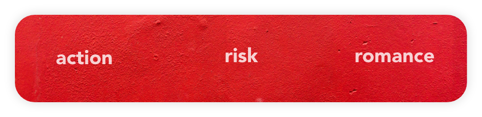
Red
Red is a powerful, vibrant and warm color. Did you know that it is the color you can first distinguish as a baby? It attracts attention, making it the ideal color for warning signs. Online, you often see call-to-action buttons being red. This is for good reason: red can trigger spontaneous buyers. It calls for action. This action, by the way, can also mean stopping. Red in a traffic light doesn't mean waiting, standing still, for nothing. By the way, red also affects our appetite.
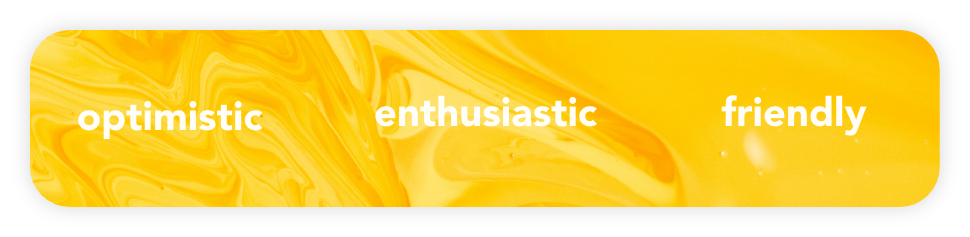
Yellow
Yellow is the color of the sun. A warm, happy, enthusiastic, positive, sparkling and spontaneous color. The color stimulates the brain and evokes positive emotions. Yellow affects your mood. Just think how you feel when the sun shines on your face again for a while since a long time... So yellow does that to you!
Red and yellow together can trigger hunger pangs
This is also known as the ketchup and mustard theory. It might also explain why fast food chains McDonald's and Burger King have red and yellow in their logo.
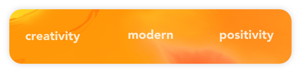
Orange
Orange is a happy, playful and optimistic color. Orange represents creativity, adventure and fun, especially here in the Netherlands, of course. The color attracts attention. Many companies that focus on optimism and friendliness use the color. Think Fanta, Coolblue or Nickelodeon.

Green
Green is a calming, cool, balanced, harmonious, familiar, kind and relaxing color. It represents development, life and suppresses hunger pangs. You often see this color in schools and with companies that dwell on the environment, such as Greenpeace.

Purple
Purple is the color of spirituality, compassion, magic, intuition, truth, wisdom, wealth and luxury. The color is used by people of elite status. Think nobility, royalty, but also within religions you see pastors dressed in purple. Purple has a calming and uplifting effect.
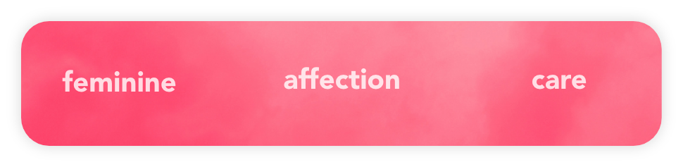
Pink
Pink is a soft, approachable, calming and playful color. You often see pink in subjects that accentuate the feminine or love. Pink can also sometimes come across as a bit childish.
Brands embracing pink include Victoria Secret, Bart Bakker and T-Mobile. Of course, not all of these sound particularly feminine, but then are more on the approachable side of the color.
Gender differences and color
These are the general experiences and feelings we have about color. But did you know that men and women also have different experiences and preferences when it comes to color?
Khouw (2002) odiscovered that men are more turned on to gray, white and black than women and that women are more turned on to the combination of red and blue than men. Men prefer cool colors; women prefer warm colors.
In addition to color, 10 more visual elements
Not only colors, but also shapes and atmosphere and 8 more elements determine to what extent your brand will be recognized by your target audience. Want to make sure you have everything set up professionally and completely? Check here if you are using them all in your marketing.
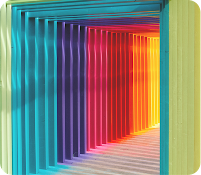
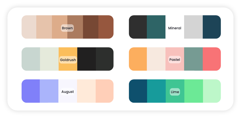
View identity color charts and choose your style
What color will you go for now in your new logo and/or identity? Often it is easier to choose if you can see a set of color combinations in front of you. That's why paint stores have color swatches ready for you to try out at home.
Such "color fans" Smart Content Creator also has for SMEs. They even include matching templates for visuals. This is to show you the effect of a combination of colors.
Professionalize more than just the color
Your brand consists of more than just color. How do you properly convey the entire brand identity in advertising and marketing? Professional advertisers have their own secret recipe for that. We reveal 7 of their secrets in an online training (free). Sign up here and start right away.
Ontdek de 7 geheimen van goede reclame
In deze online training geven professionele reclamemakers hun 7 belangrijkste tips. Zodat jouw marketing euro’s wél klanten opleveren.